Ever since getting the Apple Watch in November, I’ve been looking at my Apple Health & Activity data on a daily basis. After being disappointed by all the inaccessible graphs around the US Presidential Elections, I wanted to find out how Apple’s visualizations are handled by VoiceOver.
They’re an inspiration to many when it comes to visual design, so I was especially wondering if we can use them as an example for accessible data visualizations as well.
Daily activity breakdown
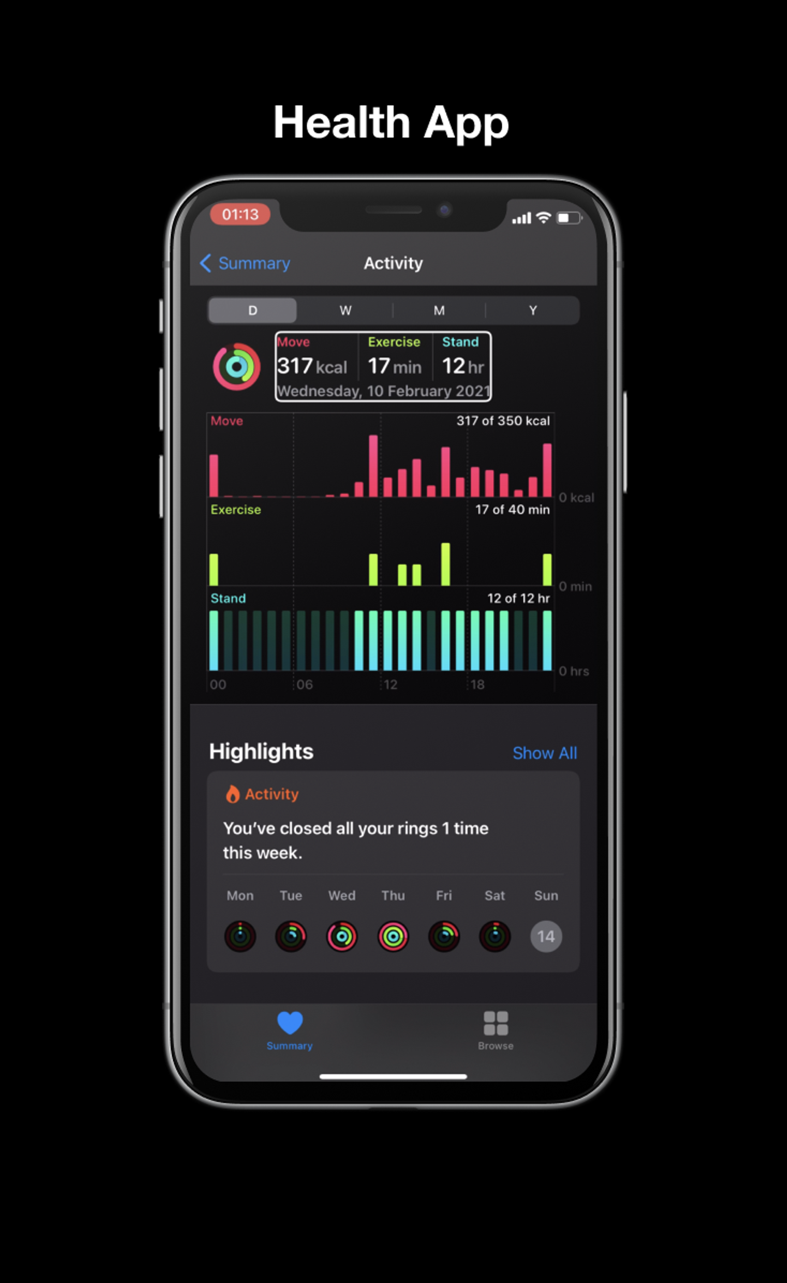
The health app has a page dedicated to activity, which visualizes movement, exercise and standing hours per day, week, month and year.
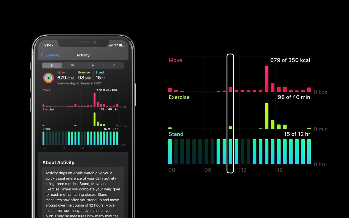
In this view, VoiceOver allows us to navigate through the graph by the hour. Each hour is a column, which includes the movement, exercise and standing values. While the labels on the axes aren’t read, that information does get added at the start of each of the columns' labels.
All the data is communicated clearly with pretty straightforward navigation. One thing I personally found inconvenient was having to keep moving along hour by hour even when there’s no data.
For example, between 1AM and 9AM the values for moving, exercising and standing are usually always zero.
But on the other hand Apple’s current solution is consistent: VoiceOver reads three values for each hour in the day, no matter what.
Whether or not consecutive blocks with no activity should be grouped is more of a screen reader usability question, for which I recommend doing user tests with blind or visually impaired folks.
The Apple Watch activity breakdown provides a similar experience. The only difference is that the values aren’t grouped, and movement, exercise and standing are read as three different graphs. Each of them is broken down by the hour, and includes the timeslot and value in the label.
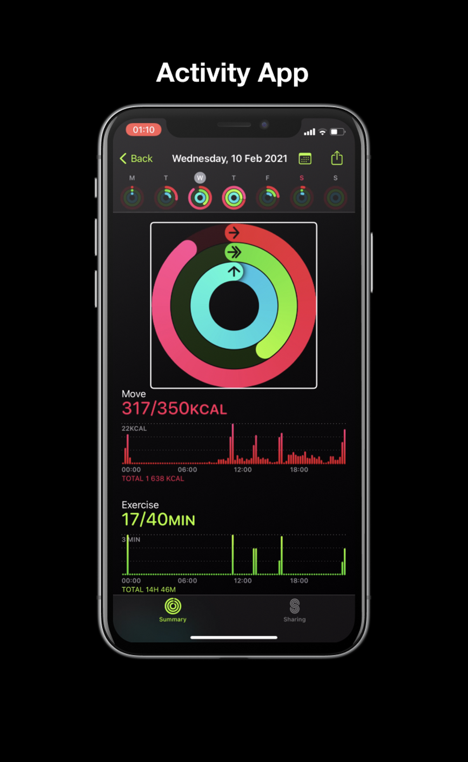
Activity rings
The activity rings display how far you’ve gotten towards achieving your daily goals. VoiceOver pronounces the (visually hidden) label of each bar, followed by the percentage that’s visualized.
In the Activity app, the rings seem to have a bug (or feature?!) that causes the activity to be read twice, but overall I feel like this one works quite well.
I’m personally a big fan of visualizing the same data in different formats. Not everyone processes data the same way, so providing enough alternatives makes the data both more accessible and user friendly.
ECG
I was really curious about how they’d solve something like the ECG functionality on the Apple Watch with VoiceOver, since it continuously has to update the data. But the answer is actually very logical: just like physical heart rate monitors do it, by using beeping noises that change in tone and frequency. After the ECG is finished, the result gets displayed (and read by VoiceOver) as text.
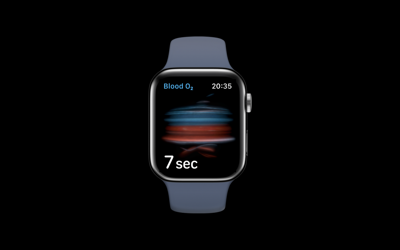
Blood oxygen
Measuring the blood oxygen also relies on sounds rather than words. There’s a beep every second for the duration of the countdown, which starts speeding up during the last few seconds. Once the timer is done, the results get focused and are browsable using VoiceOver.
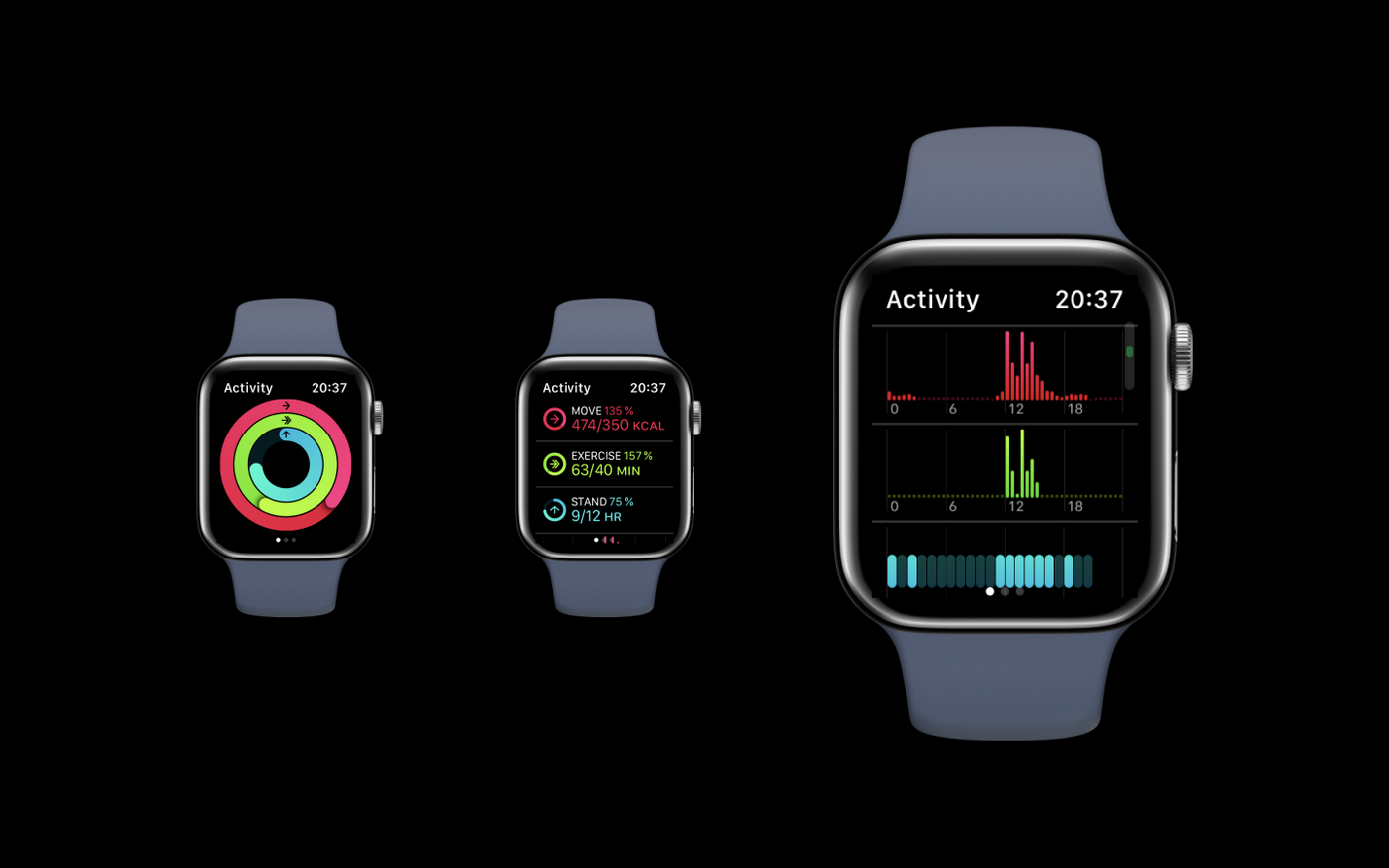
Watch faces
One of the watch faces that I use a lot has several activity visualizations on it. It’s basically the same as the iPhone’s activity app, but much more compact. Unfortunately, it doesn’t always work very smoothly with VoiceOver.
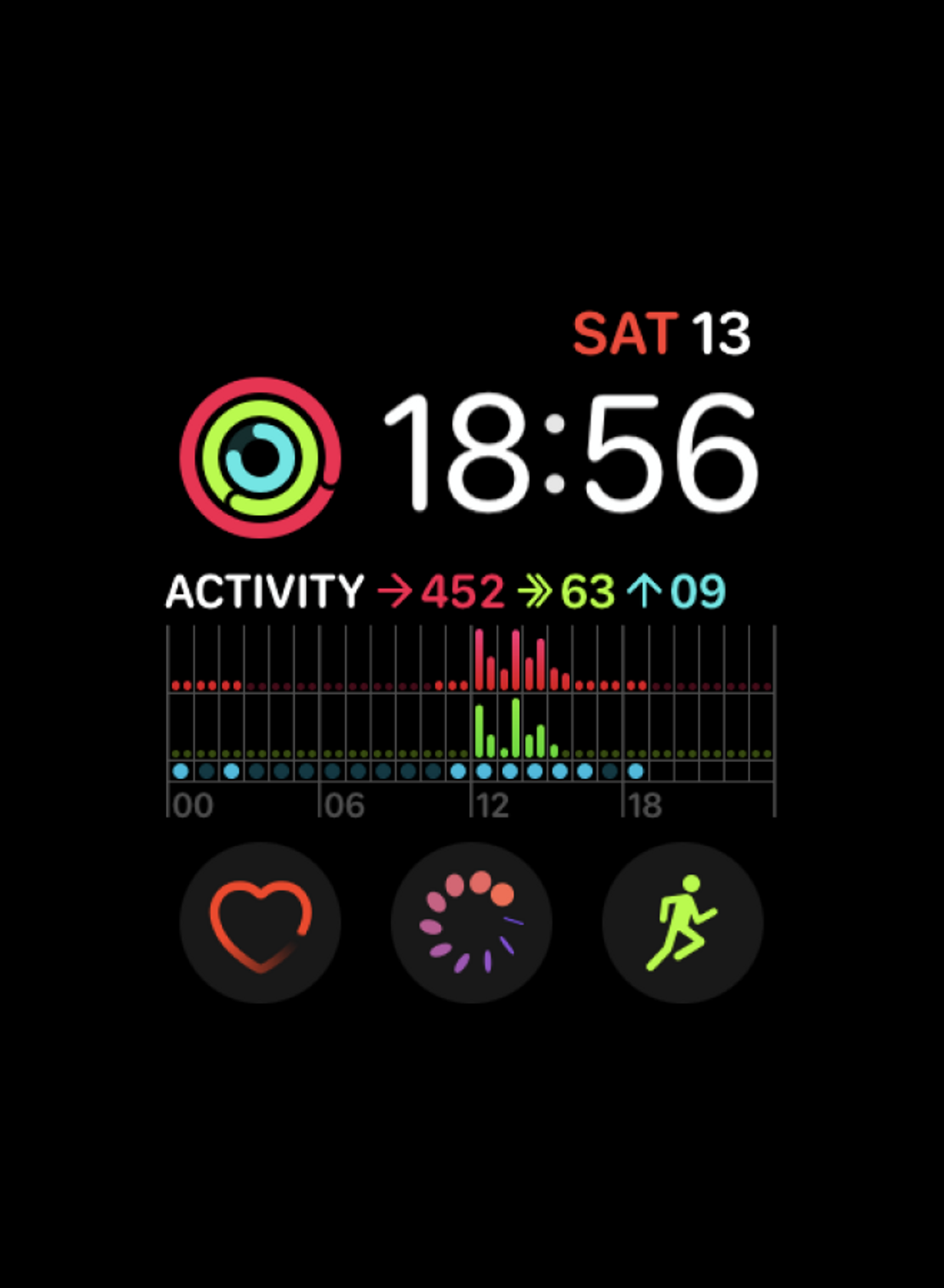
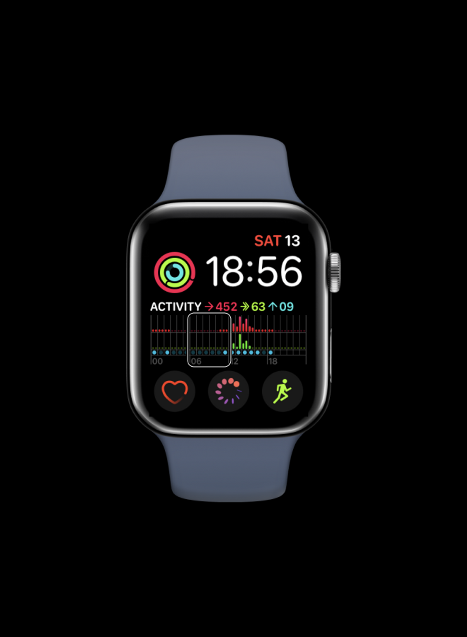
The first time I tried using it, VoiceOver didn’t read the values of the activity rings and only said “Activity” with no further information. After opening the activity app and going back to the home screen, the values were read correctly.
Similarly, there are some issues with the bar chart underneath as well. The values are grouped in four six-hour intervals, which is probably because swiping through 24 hours of data on a small surface isn’t necessarily a pleasant experience. The buttons and text on the screen are also focusable by clicking on them, which is expected behavior but also tends to make navigating with VoiceOver on a bit of a challenge.
However, it’s never mentioned that these are 6-hour blocks, and VoiceOver only reads the “00”, “06”, _“12” _and “18” labels, which is a bit confusing.
The grouping also has a few bugs. In the example above, the standing hours that get read (2 hours, 2 hours, 6 hours, 1 hour) don’t match the visuals or text (9 dots or hours). And even though the total amount of burnt calories is 453 for the day, VoiceOver consistently reads 0 calories for each block.
Highlight cards
One last thing I appreciate in the health app are the cards that show highlights of the data. Each graph that’s displayed in those has a short summary written on top, eg. “During your last walk, your heart rate was 114–158 beats.” or “On average, you’re walking less this year compared to last year.”.
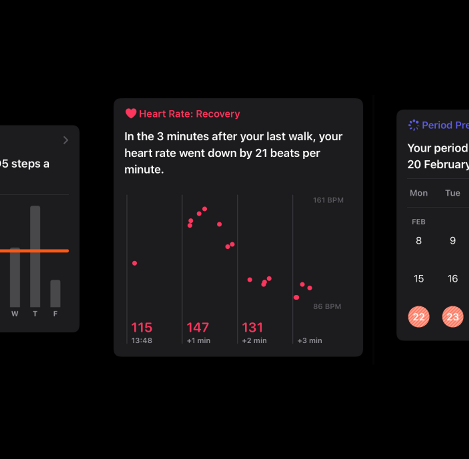
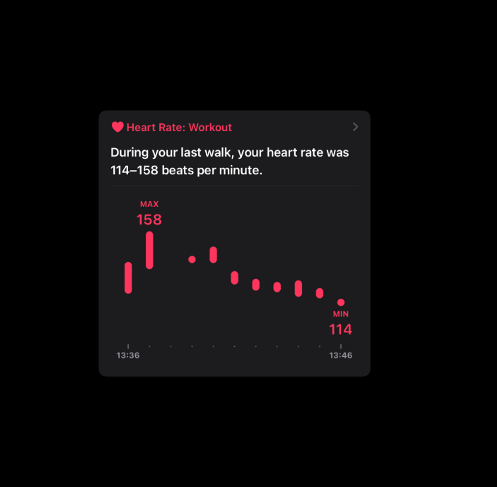
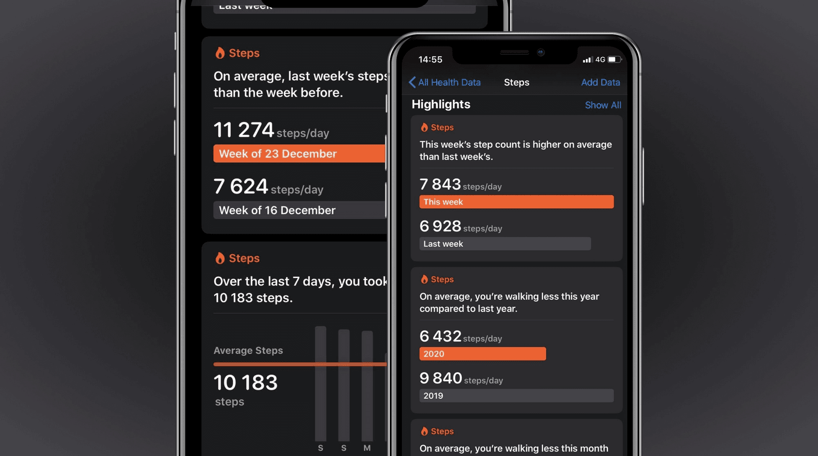
For me personally, the summary makes it quicker to get the information I need, since I don’t have to find and read labels or process any visuals at all. But it’s also a nice addition to the graphs when listening to them with VoiceOver. The goal of the graph is to get a quick summary or highlight of the data, which isn’t easily solved by swiping through a list of numbers.
The graphs in the cards were read differently for different types of graphs as well, but seemed to follow a pattern: the graph wasn’t read when it served as an illustration of what was already described in the summary, but numbers bringing more detail to the summary were included.
Apple’s graphs set a good example, so what can we learn from them to make our own visualizations more screen reader accessible?
Whether Apple’s solution would work well for our own graphs is entirely dependent on what we’re trying to visualize, who our visualizations are for and how they want to use them. In fact, I’m quite sure Apple can still improve their graphs as well. As we improve our products, we will always find new insights, and as technology changes we will also keep finding better technical solutions to the same problems.
But that’s also why I think Apple’s visualizations are good to take an example of: they have a basic level of decent accessibility that can be used to get actual feedback. The data gets read by VoiceOver, and does so in a way that makes sense. Regardless of what can be improved, the graphs are both usable and testable.
This is a big contrast with the visualizations around the US Presidential Elections I examined in November 2020, where almost nothing was accessible to screen reader users. The main feedback people will give about a graph that reads “Image” over and over again will be to at the very least add alt text. Not much can be said with regards to the data experience if the data isn’t even there.
That’s why it’s important to have accessibility included from the start. The faster the data is accessible, the faster we can test how blind folks are using the graph and what would give them an even better experience. As long as we have that plan in place, we can start small and still end up with a good and accessible solution relatively quickly.
More resources to get you started
- Dataviz Accessibility Resources
- An introduction to accessible data visualizations with D3.js
- Accessibility in d3 Bar Charts
- Accessibility in d3 Donut Charts
- Writing Alt Text for Data Visualization
🎙 I also give talks about dataviz accessibility. My Outlier talk (together with Frank Elavsky and Larene Le Gassick) will be published in the upcoming weeks, and I’ll also be giving an introduction to design accessible graphs at axe-con.
💌 If you’d like to book me for a talk at your company or event, you can contact me through Twitter or collab@fossheim.io.
Hi! 👋🏻 I'm Sarah, an independent developer, designer and accessibility advocate, located in Oslo, Norway. You might have come across my photorealistic CSS drawings, my work around dataviz accessibility, or EthicalDesign.guide, a directory of learning resources and tools for creating more inclusive products. You can follow me on social media or through my newsletter or RSS feed.
💌 Have a freelance project for me or want to book me for a talk? Contact me through collab@fossheim.io.
If you like my work, consider:
Similar posts
Sunday, 12. January 2020
An intro to designing accessible data visualizations
Wednesday, 20. May 2020